Design Thinking: Improving In-flight Entertainment
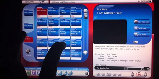
Emirates, one of the most prestigious airline companies in the world is considered to have the “Best In-Flight Entertainment” two years in a row, according to Airlineratings.com. Sure, you have access to the news, your email, and can browse over 1,800 different channels of movies/games/television in 30,000 feet, but do airlines really pay attention to the little details in building this technology?After doing some research on my flight from Chicago to San Francisco on Virgin America (also known for having one of the best IFE systems), I’ve come to realize majority of these airlines don’t pay attention to the design and ease-of-usability when it comes to in-flight entertainment.
I give Emirates credit for giving their flyers access to great content and the ability to clean out your inbox, when you have nothing better to do 30,000+ ft in the air. Though, we live in an age where design plays a key factor in our everyday lives. Our brains are wired to the simplicity of our smartphones and tablets. Why can’t the 7th largest airline company (by revenue) design a better IFE system for its aircrafts?
This question was being repeated in my head throughout the first half of my flight. So as any ADD design freak would do (ok maybe just me), I decided to pull out my laptop and design a quick mock of what I expect 2015 IFE systems to look like. Thankfully, Virgin America has an IFE system in all of their planes.

This screen was what I decided to start with. To give a quick background, Virgin America deployed their IFE system, Red™, in July 2010. They announced their plans on upgrading from V2 to V3 by July 2013, which would include surfing the internet, but that upgrade never happened.
Red™, similar to Emirates, seems to be stuck in the world of glossiness. Glossy this. Glossy that. This display does not match Virgin’s brand colors or style. All while the navigational menu consumes a large chunk of the interface.
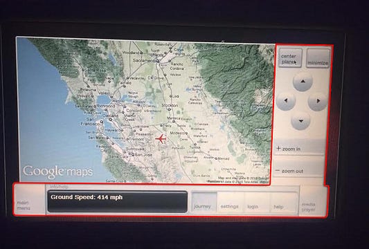
The red highlighted parts above show the map being overlapped by various navigations and controls, leaving parts of the map not visible. I found this very distracting and imagined a better solution where the menu bar isn’t in the way — when exploring the map features during your flight.
One thing to note, Virgin is using an outdated version of Google Maps, specifically the 2010 version. Google Maps has improved drastically over the last five years. One would assume a simple software update would do the trick.
A few miscellaneous things that stood out to me were the unnecessary call-to-action buttons (ex. Minimize, Center Plane, etc).
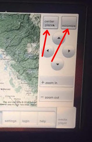
Minimize can be replaced by tapping off of the map, and Center Plane can be replaced by an icon, or by tapping on the plane in the map.
I mocked up a quick design below to give a better visual of what I would expect a 2015 IFE system to look like. I spent roughly two hours researching different IFE systems, sketching out wireframes, and designing the mocks below.
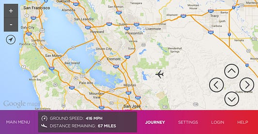
In the above mock, I updated all the visuals to match Virgin’s brand identity, while still focusing on the core functionality and minimizing key distractions.
I removed the side panel and allowed the map to be more visible. The map controls were aligned to the bottom right of the screen. I moved the zoom functionality and the ability to center the plane — to the top left. These changes make the display feel less cluttered.
Let’s take another screen from Virgin’s RED™ system.
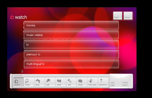
This is their list of different types of content you can consume. Movies, Music Videos, TV, etc. I picked this screen because it’s similar to 75% of the other screens on RED™.
The question I asked myself before designing a mock, was how do you make a screen with multiple options not feel so boring, yet keep it highly engaging, by making the “popular by demand” options listed first.
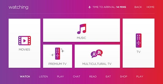
Here’s a quick mock I put together.
IFE systems play a vital role in a passenger’s journey from point A to point B. The last thing you’d want, is to provide your customers with a crappy IFE system that is seven years outdated.
These mocks could have been designed plenty of different ways, but the most effective design, is where the user feels a sense of happiness when navigating through your product. The end goal is to make it seamless when interacting with different user flows.
Now I don’t think my design is anywhere close to being perfect. Though, I believe this is a step forward in making IFE systems up to date with current design trends and usability.

How I’d react when Virgin upgrades their IFE system.
No comments:
Post a Comment